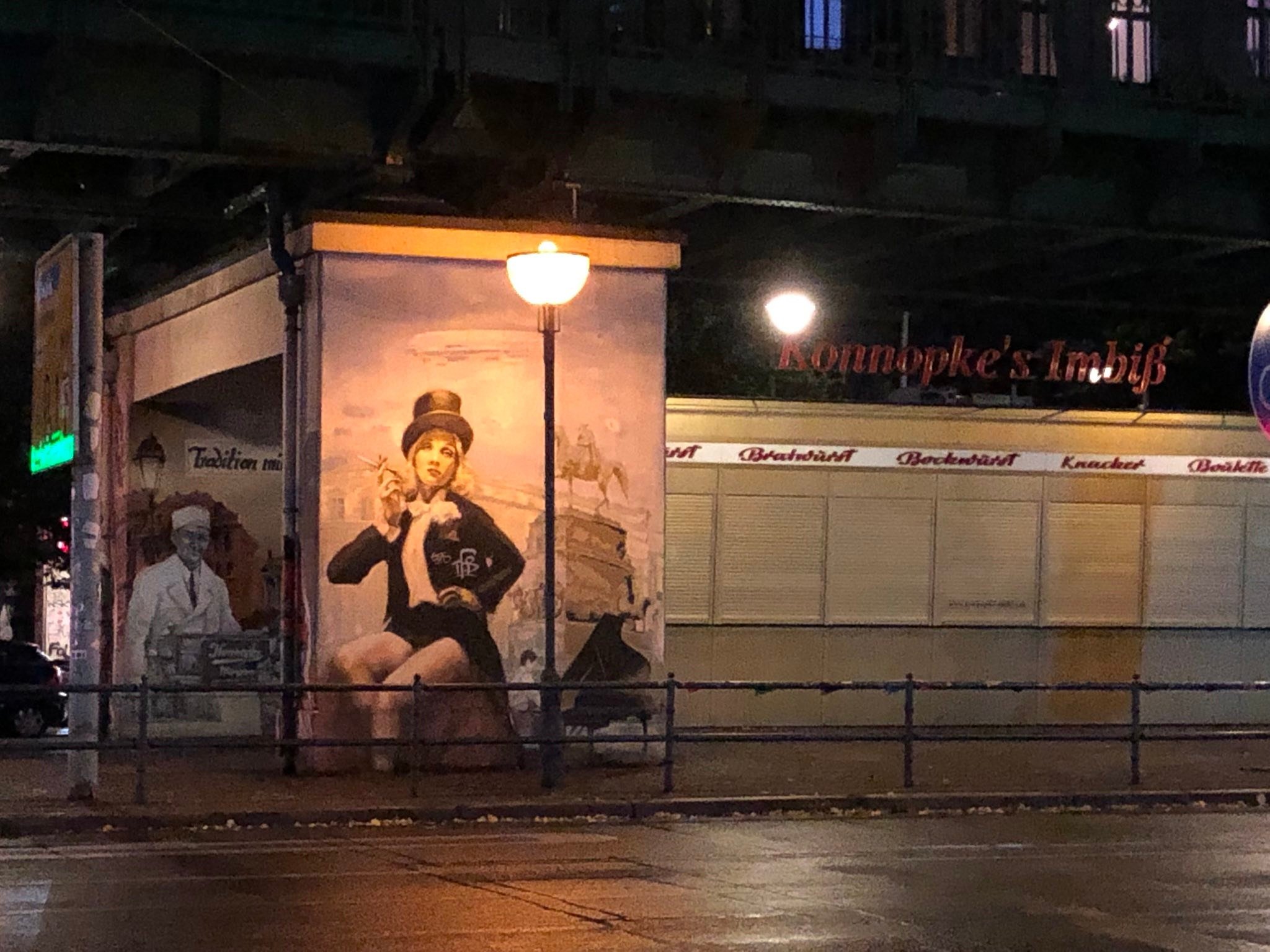
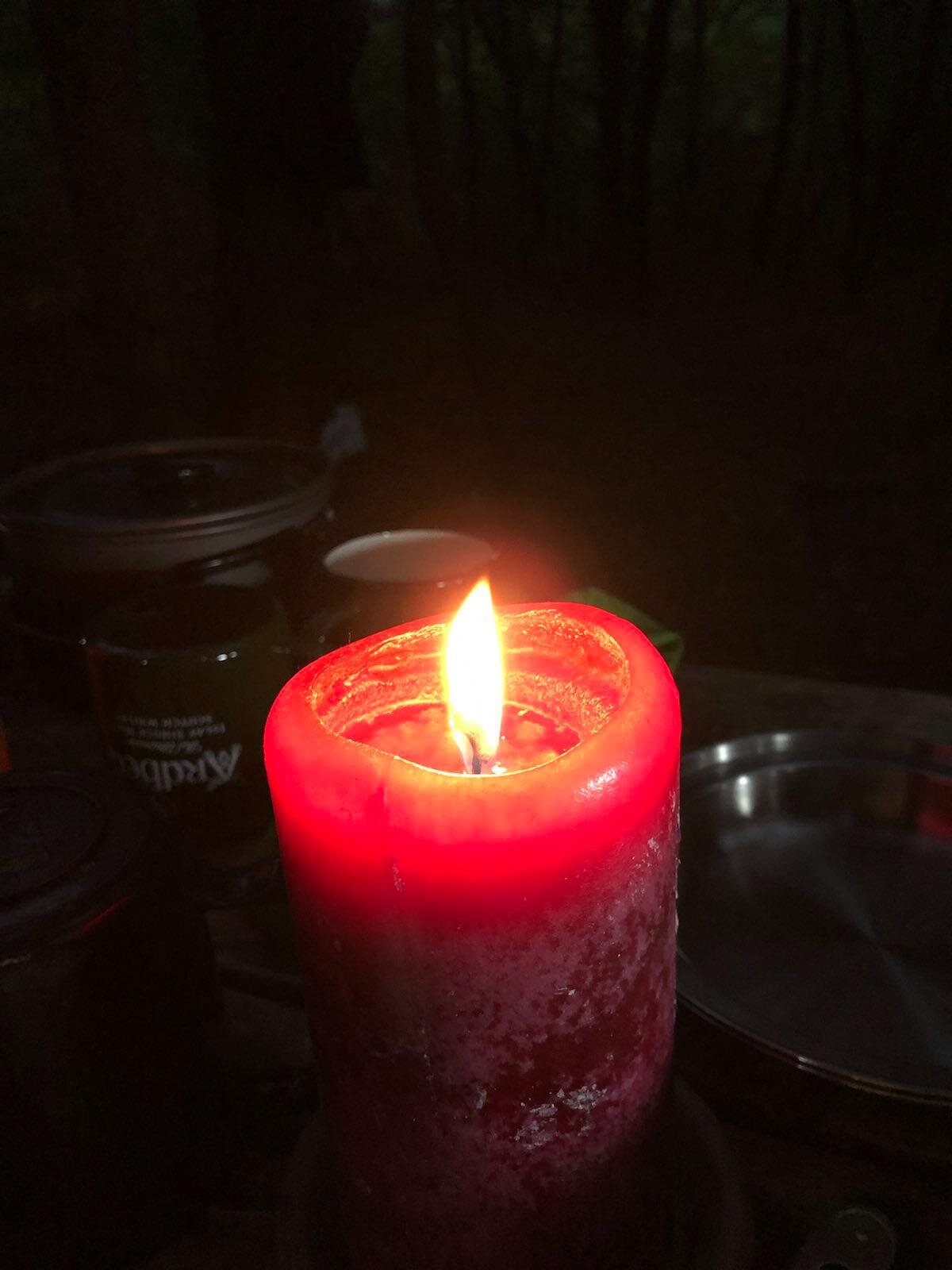
I like the feeling that comes, the moment one steps into the woods, and one's cellphone falls out of service… When the atmosphere shifts and a strange noise is heard: "yo—what’s that?” It’s then when one’s sense of mystery returns and your mind departs from safety and into alertness primed by imagination (Thankfully, it isn't a bear). I love the smell of campfire, I love watching the stars and distant planets in the darkness.
I did some traveling, as well. And, in my usual way, took the time to learn how to do a lot of things. Like, grow fresh tomatoes and basil from my fire escape, to make infinite Caprese salads. I got into leather restoration and fixing the sleeves on my brother’s ruined jackets. I spend a lot of evenings learning chords on the guitar, which is nice to do while working through problems in my head. And let’s not forget the endless adventures afforded to me on my bicycle traveling between boroughs—the Williamsburg Bridge and the Marine Parkway Bridge towards Far Rockaway being my personal favorites. My most ambitious ride was one I made from Queens through the Northshore of Long Island. Cultural consumption: Old Hollywood films, banned 18th-century French novels, Muddy Waters, “The Eyes of Laura Mars.”
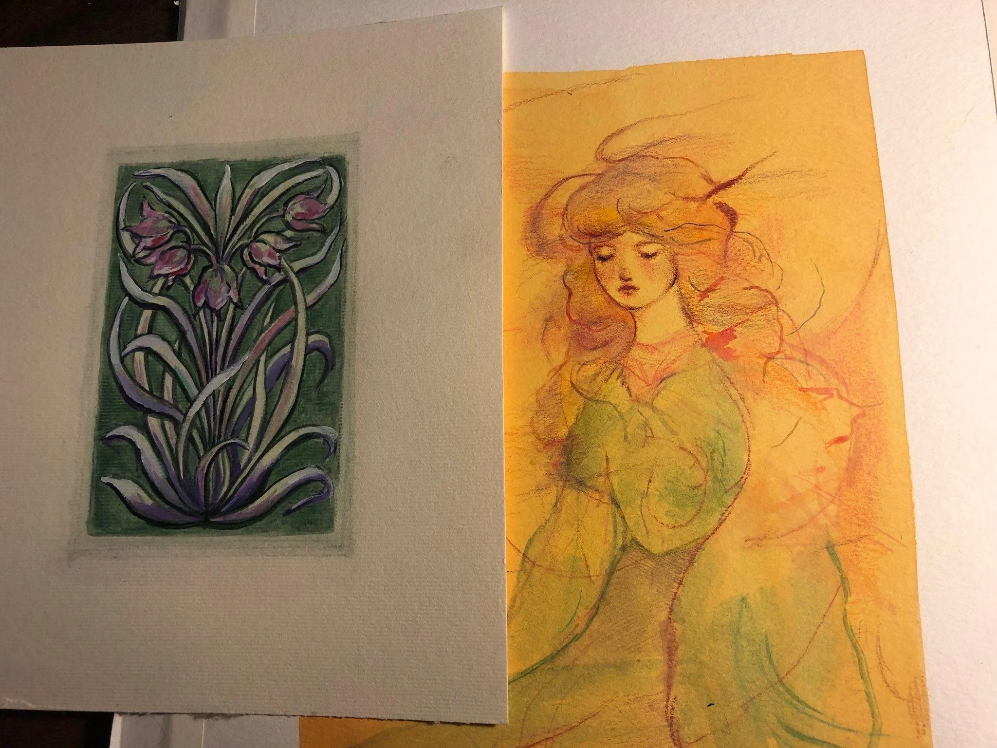
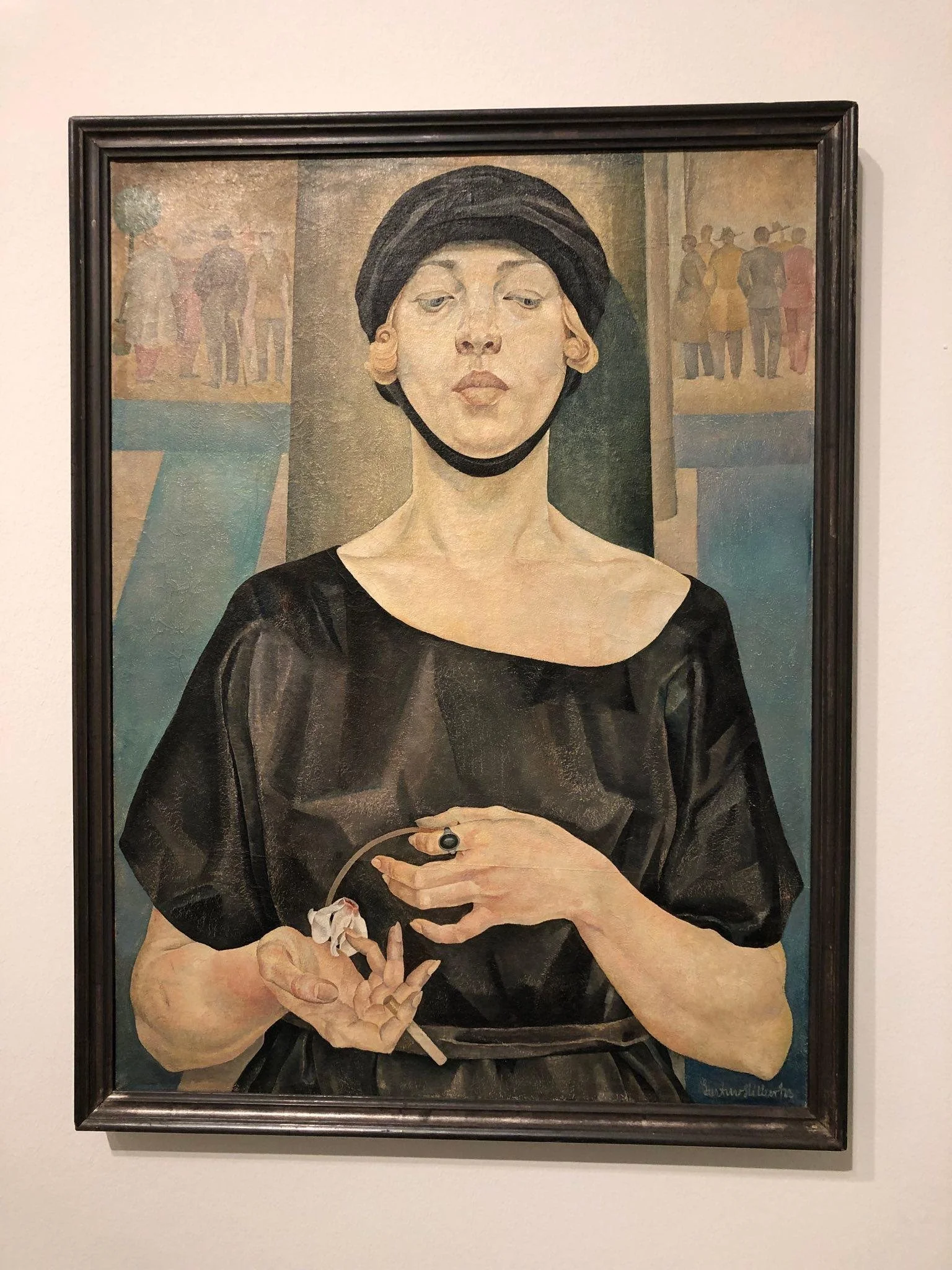
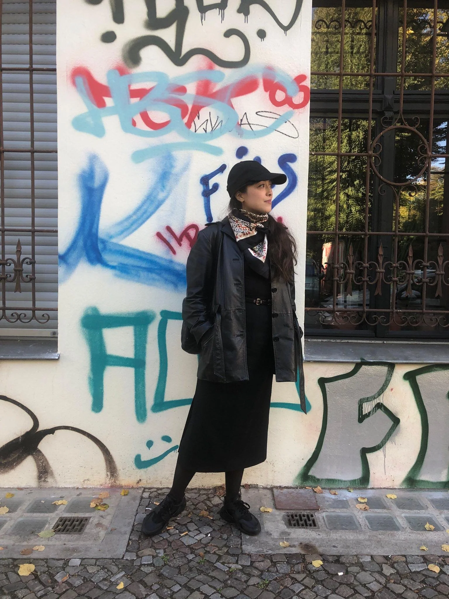
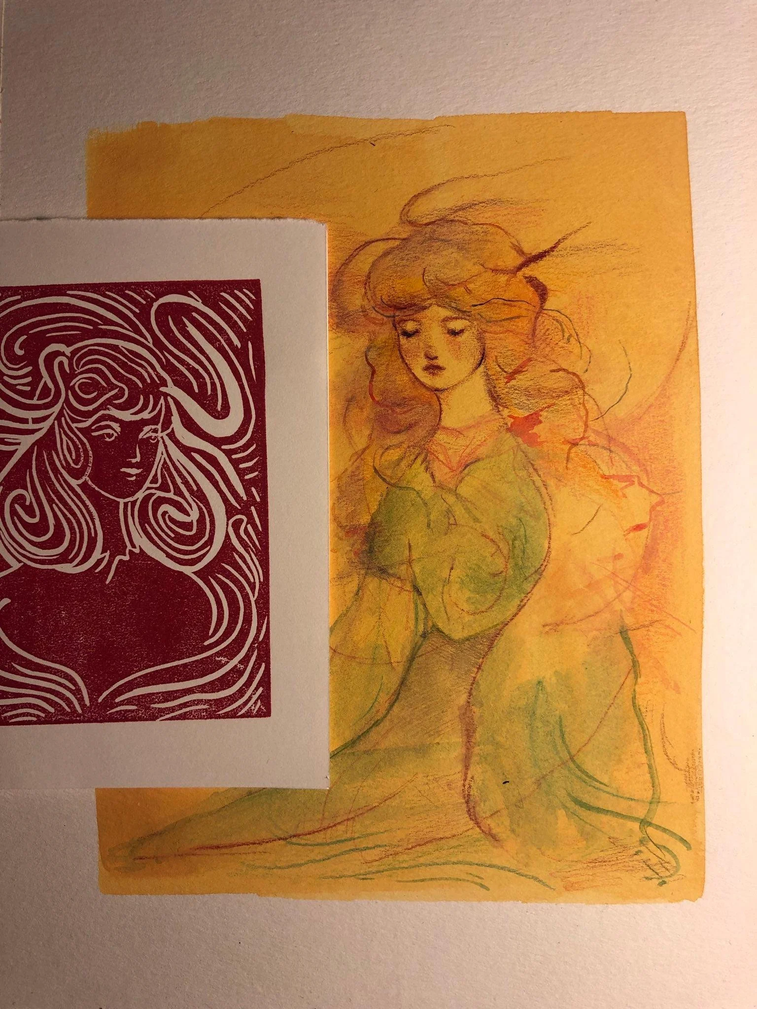
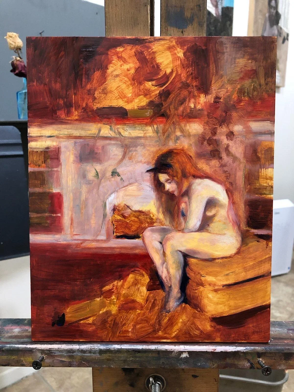
I've been finding a lot of inspiration making color studies of some of the artists whose color palettes are currently interesting to me, like Paul Gauguin and Picasso. while my work generally tends to follow a more muted palette, a part of my growth recently has been a more careful consideration of color, and the language they communicate. My transition from water-based mediums like gouache to oil-based mediums introduced to me a completely different methodology in overlaying color, which has me reconsidering how I was doing it before. My personal style is reflecting this change, too. Bright orange scarves, celadon caftans, and magenta blouses are flooding my closet.
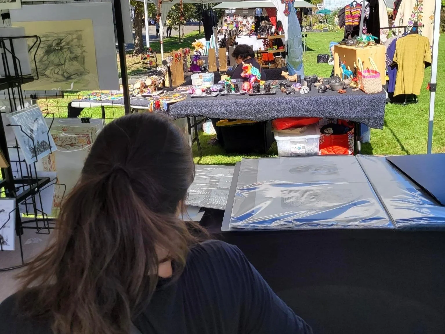
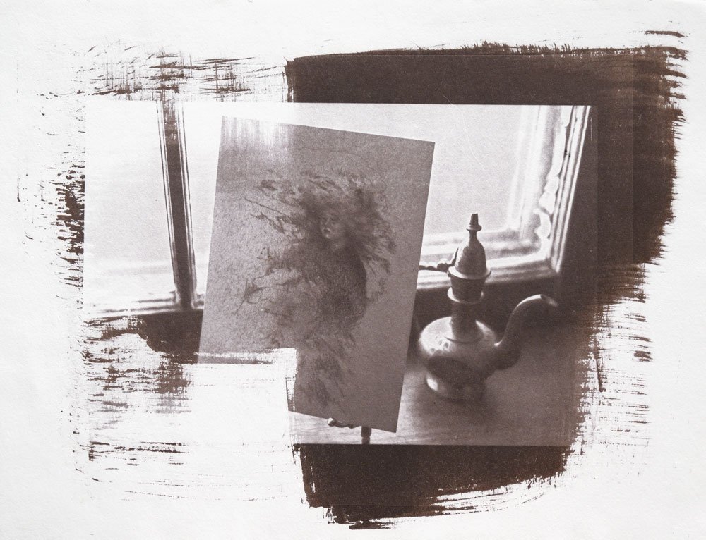
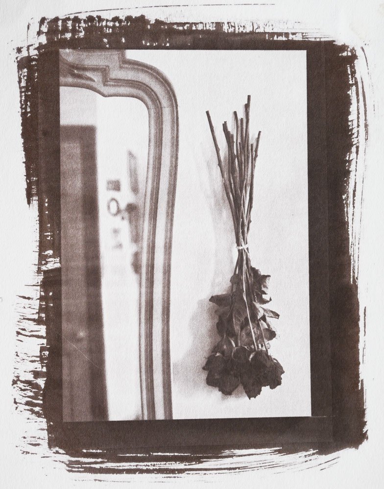
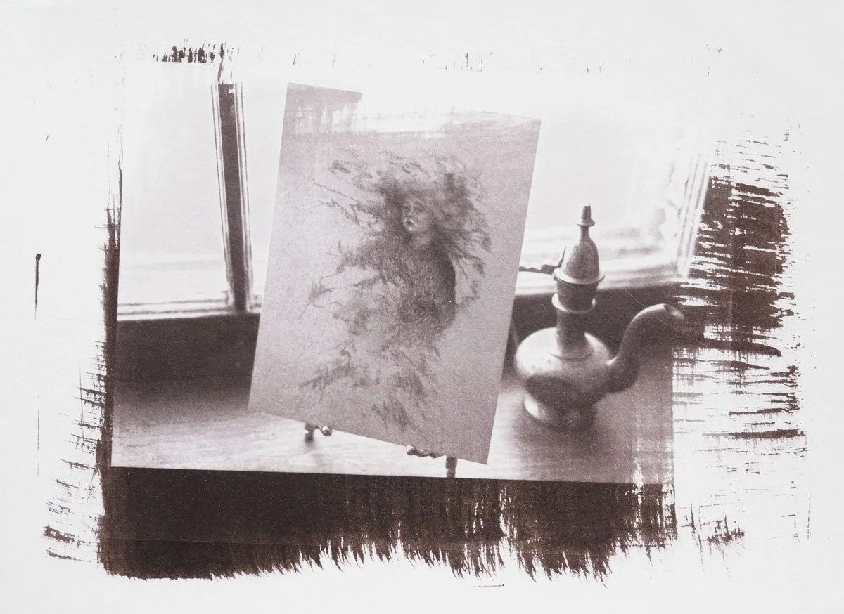
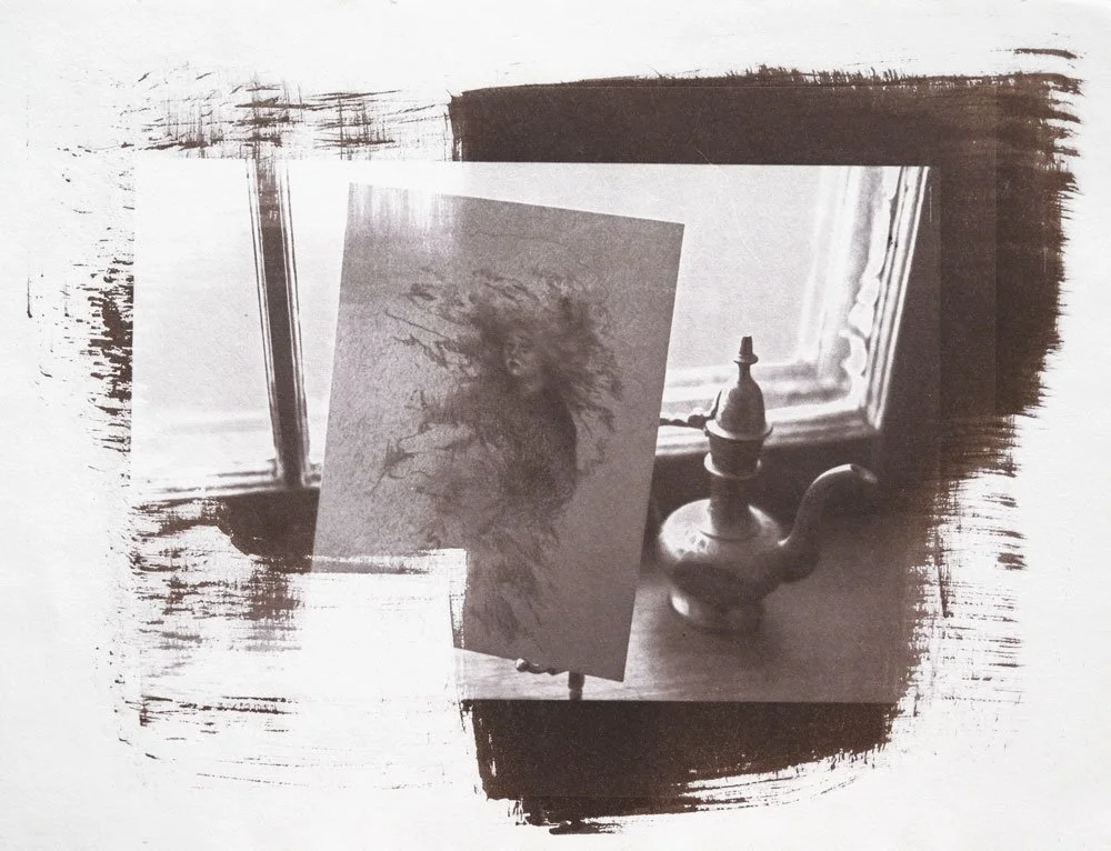
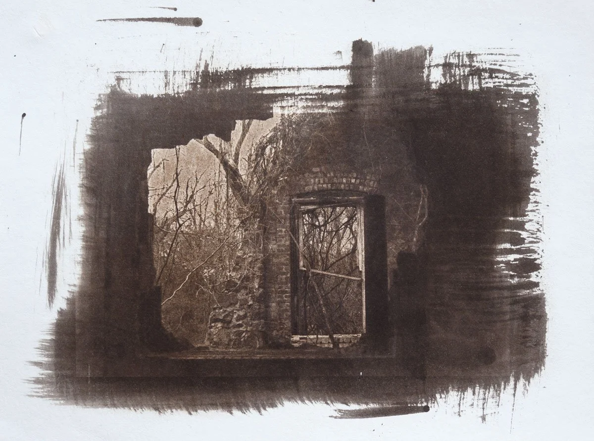
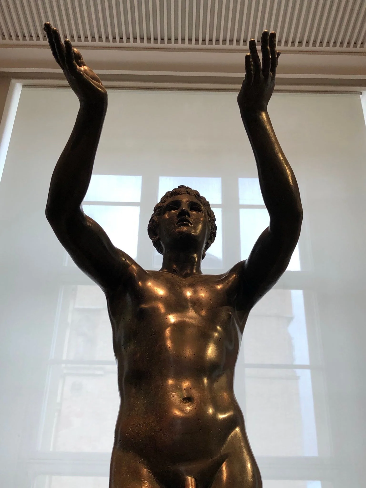
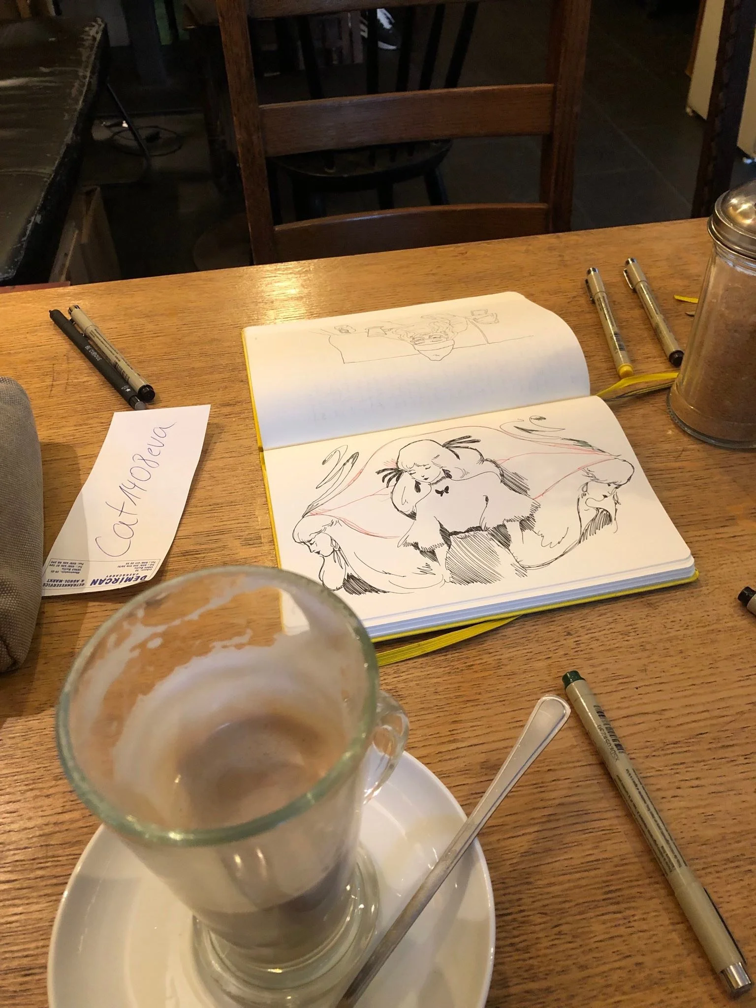
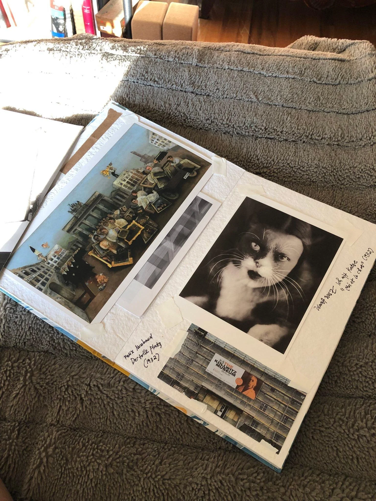
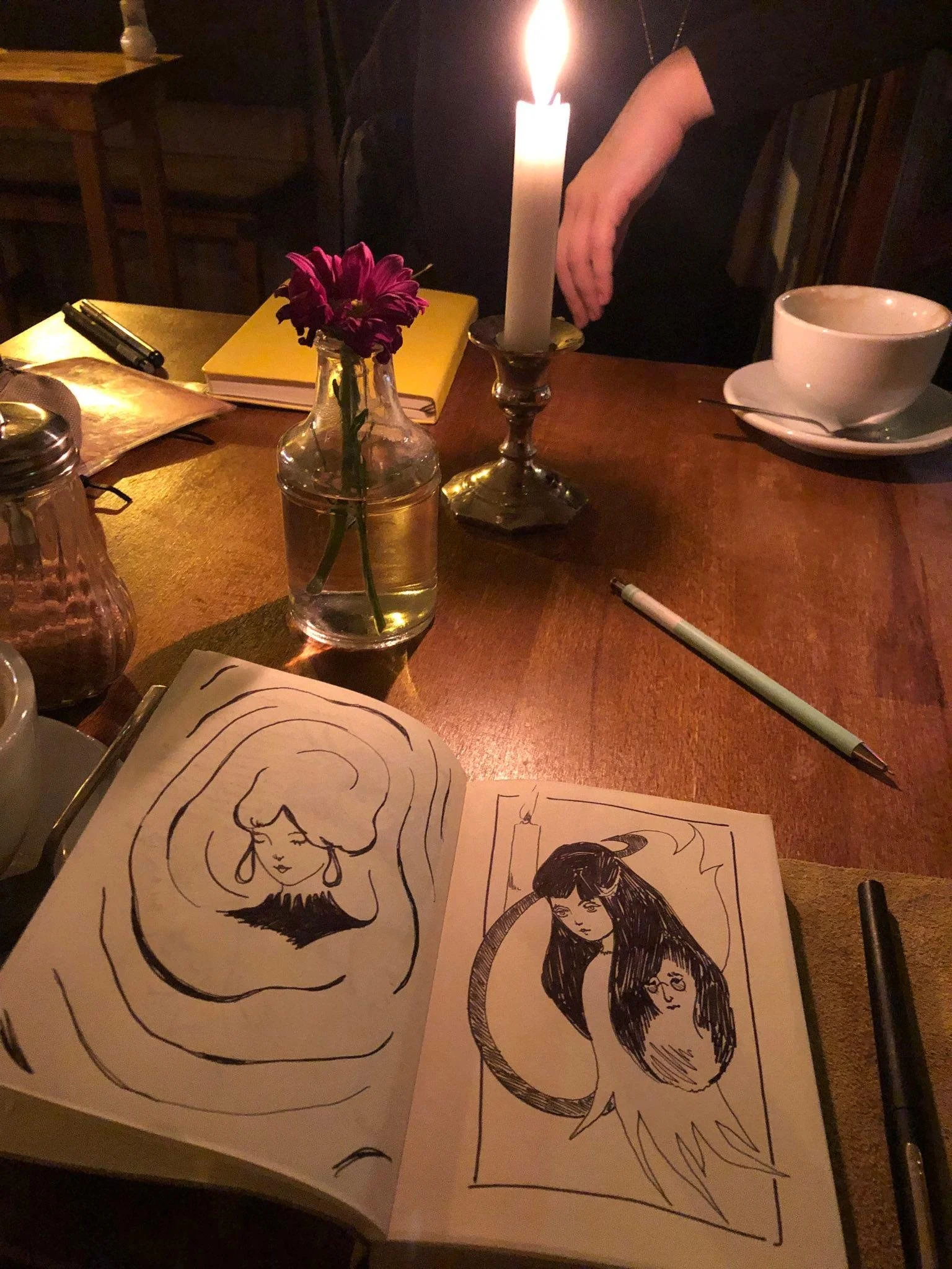
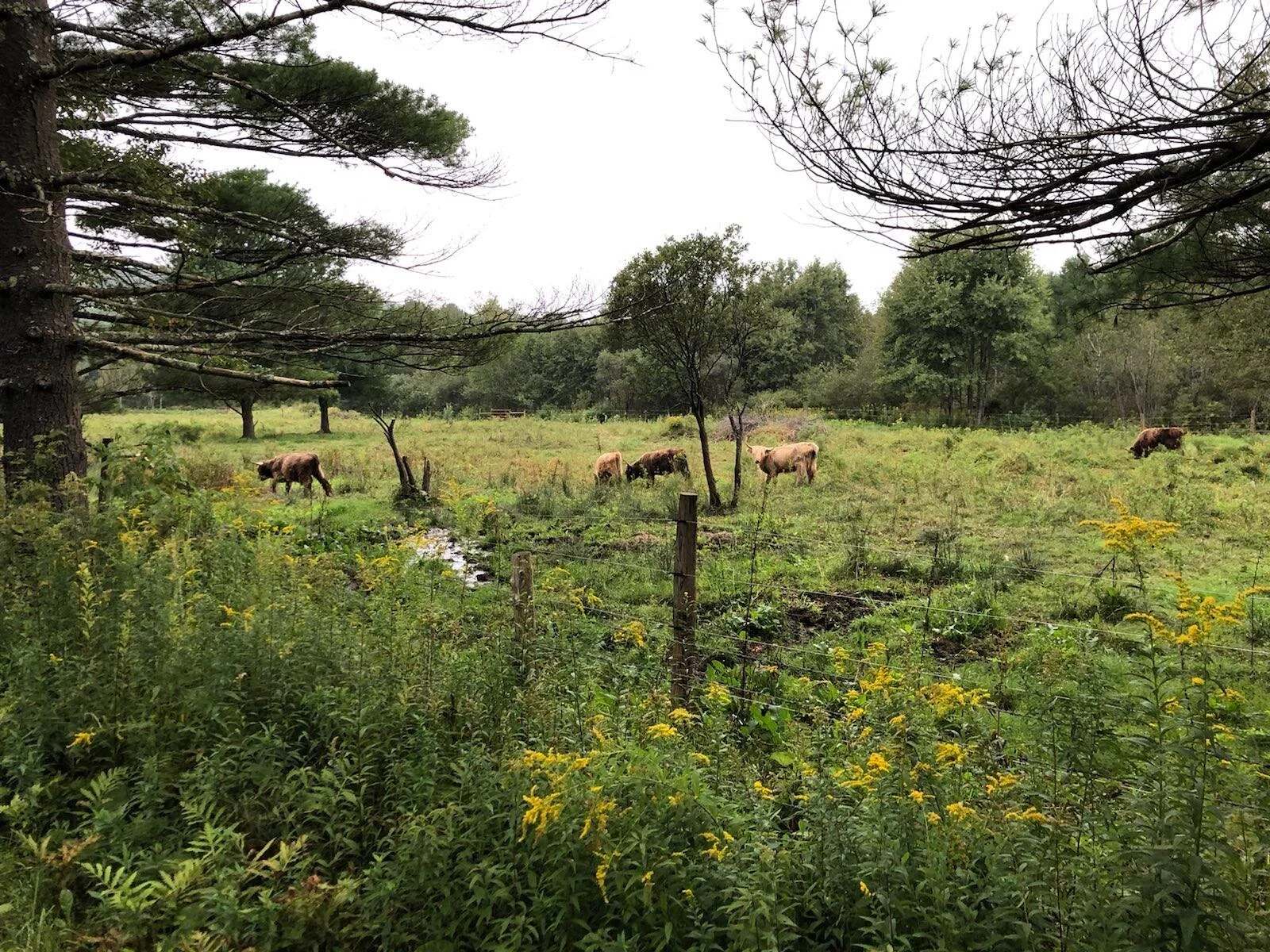
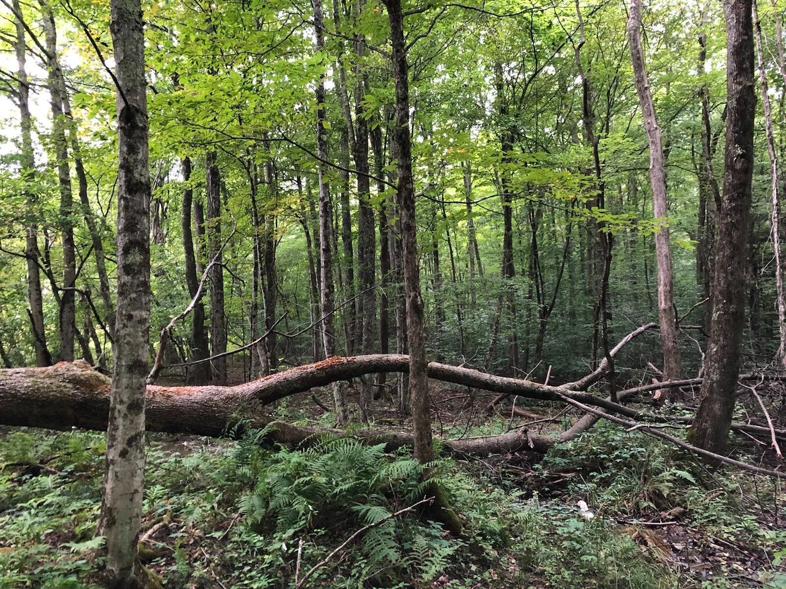
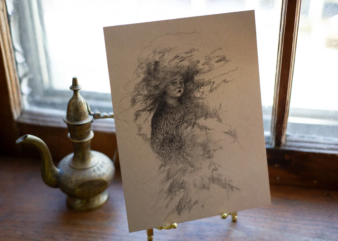
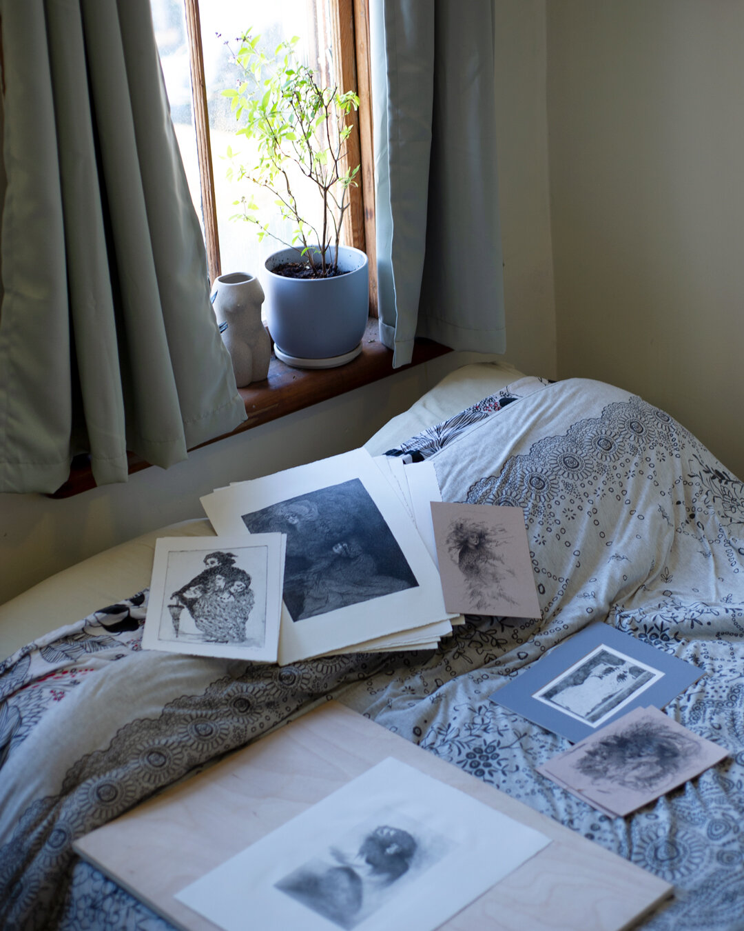
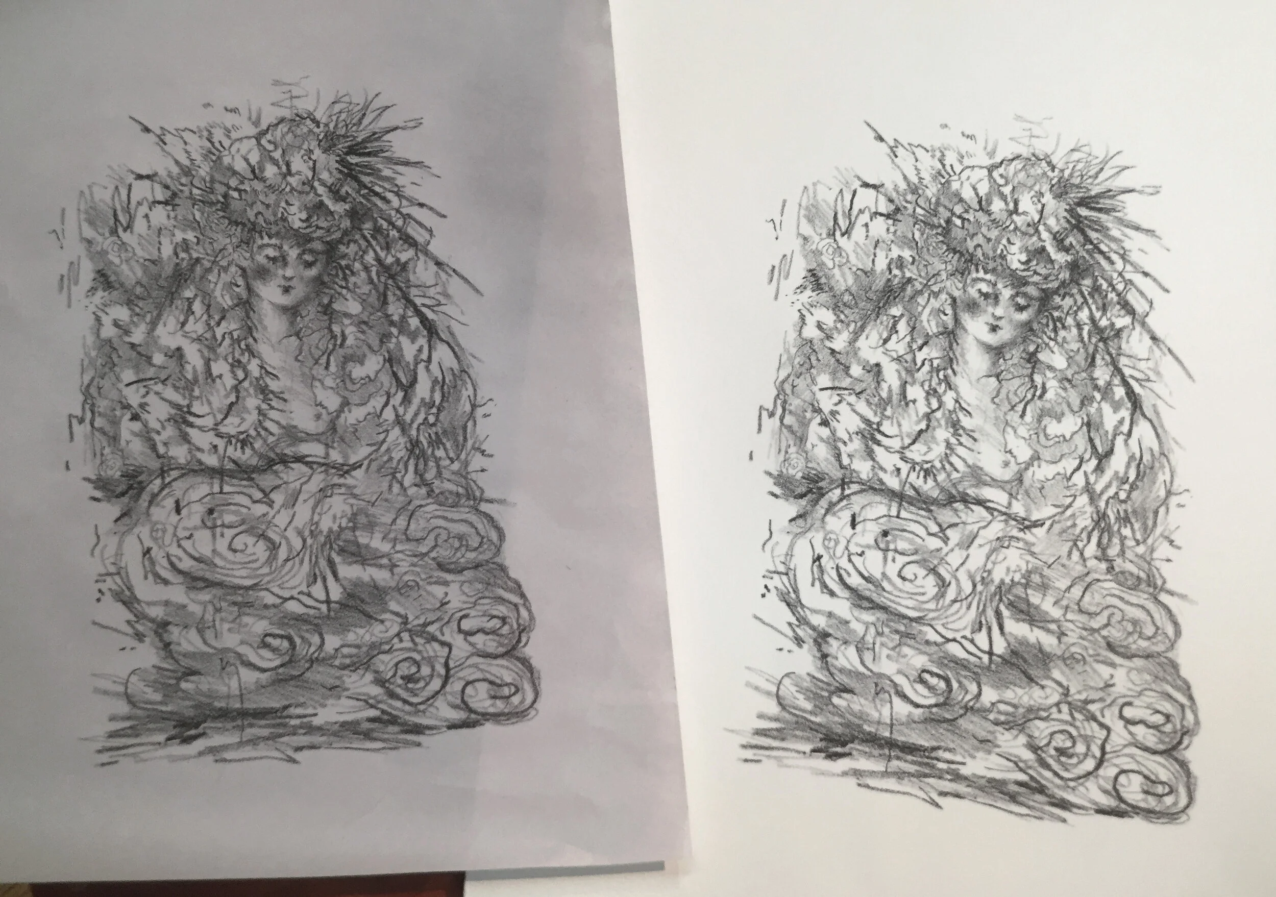
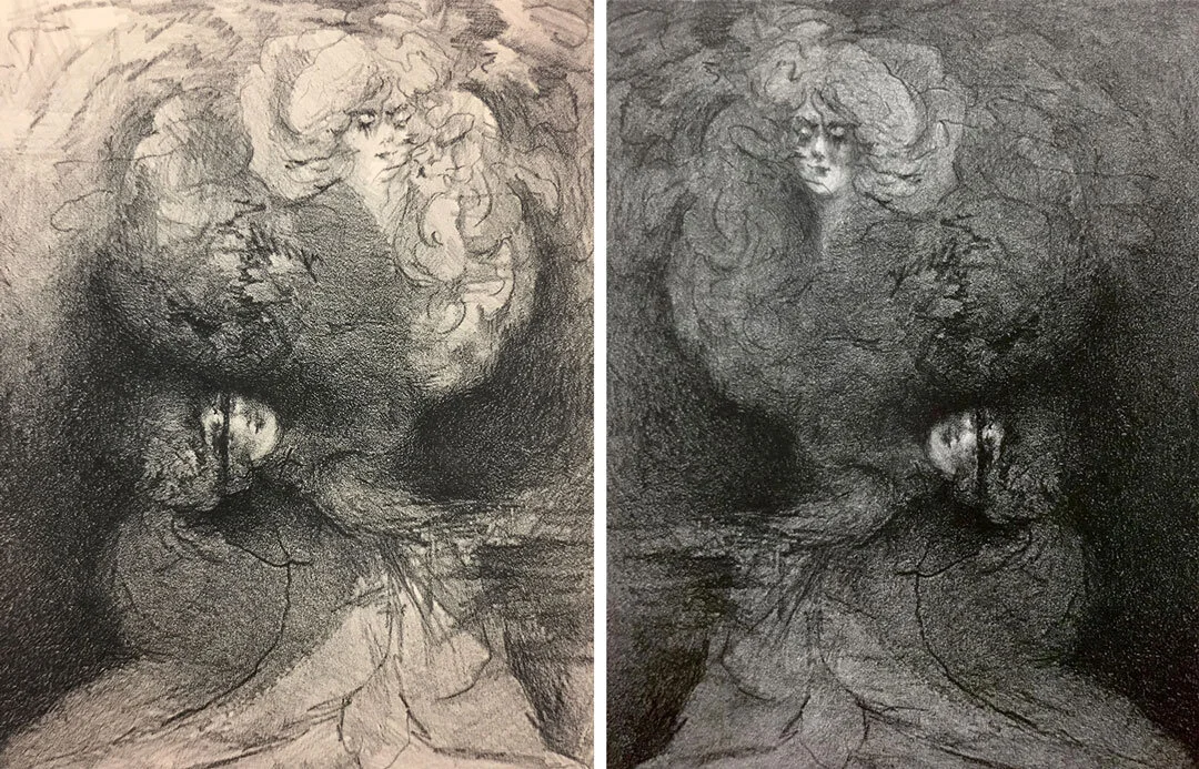
I’m sharing here some pictures from upstate, the paintings I made in a class, my work area, alongside some narratives I am working on involving a beach, a haunting. I feel like the best part about working, are the in between stages when you do not know what is going to happen, and you are following your intuition to get to the other side. Looking forward to filling you all in on what is happening next!


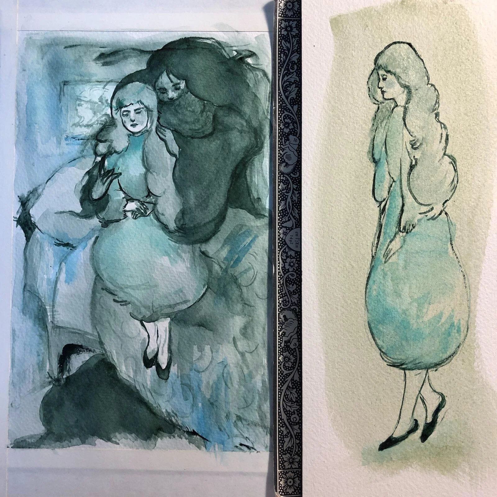
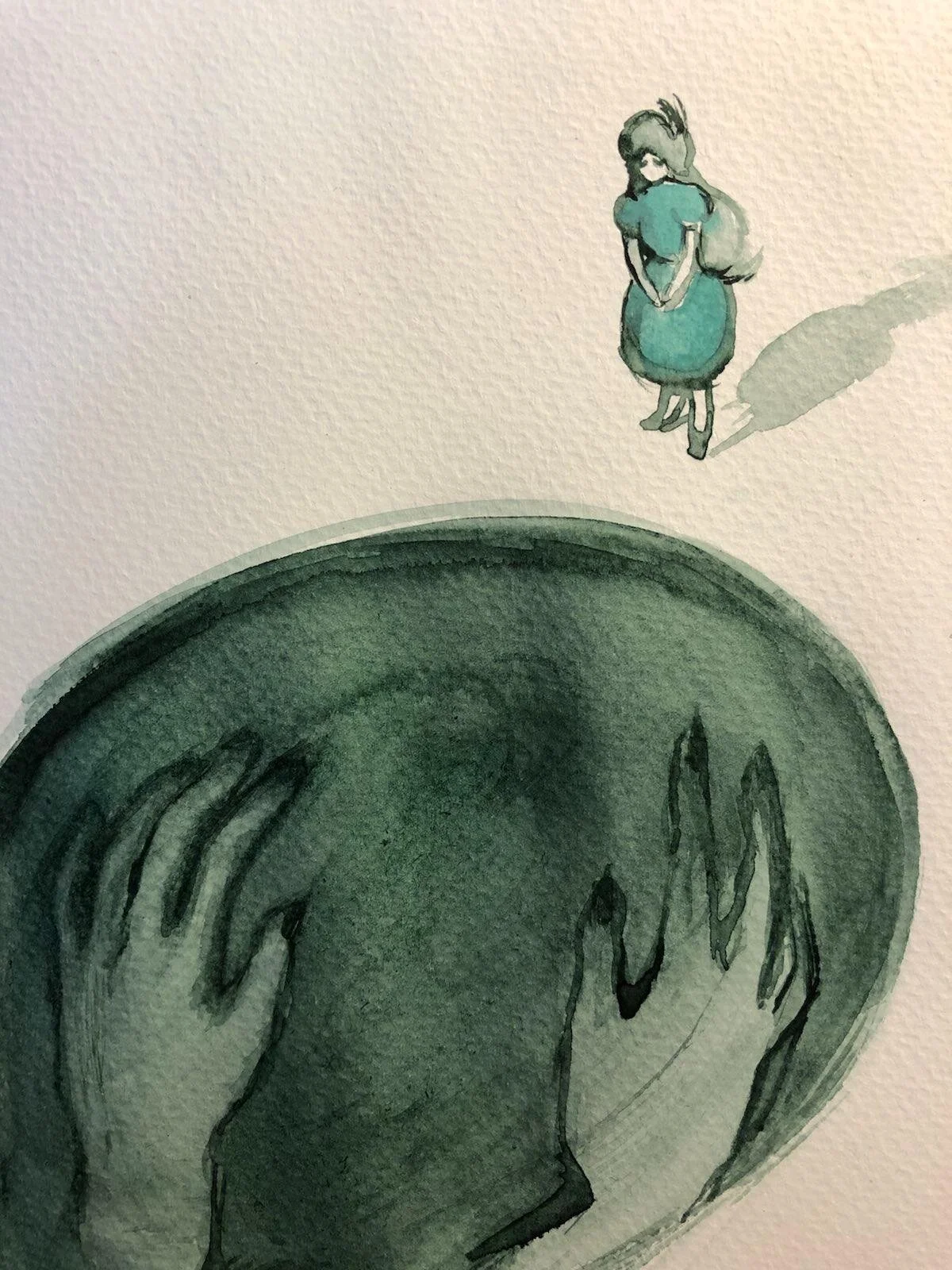
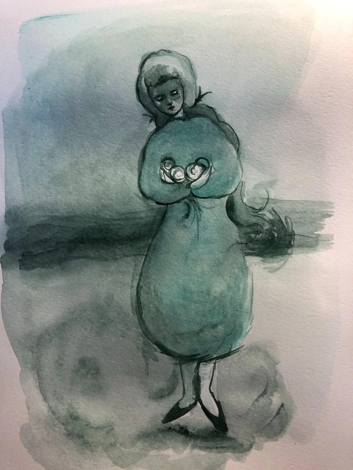


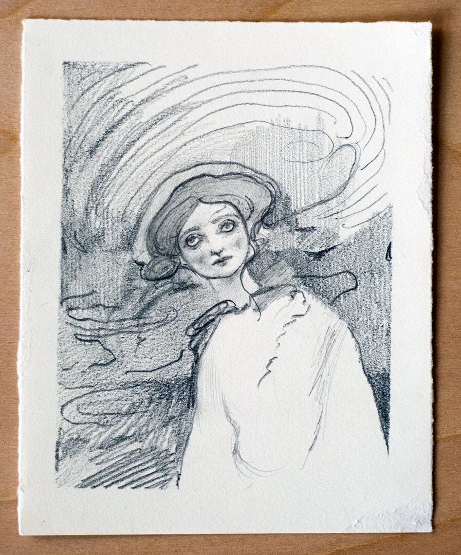


![(2021), Watercolor and Ink [in progress]](https://images.squarespace-cdn.com/content/v1/56ca5e07859fd07d71be46ea/1611792767899-Y5M4T81LXZ9837CXVXEA/1.27.21-robyn-tang-drawing-in-progress-web.jpg)
